
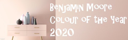


Benjamin Moore recently unveiled its colour of the year – First Light – a Fresh Palette emblematic of hope, potential, a revitalized spirit, and above all, agender styling as well as lack of any seasonal borders and connotations– a befitting ‘backdrop for a bright new decade‘.
Just recently, I got the opportunity to attend the 2020 Colour of the Year – Designer Masterclass with Tony Snyder – hosted by Ethan Allen and Benjamin Moore in Dubai. Tony enlightened us with many design principles in relation to choosing colour palettes; she started off with the three most important ones:
1. Create a Scenario:
Know your client/space/subject well. Is it a family space, a bachelor pad, a rented or a self-owned space? Try to hear your client’s inner voice and observe; what are they wearing – monochrome, playful, brave, daring, casual or formal – each is likely to signify a different colour palette. Do you see more pictures on their walls, small knick-knacks or would they rather like it clean and minimalistic? Evoke as much conversation as you can to profile your client needs,vibes and requirements as accurately as possible.
Tip: You could ask your client to introduce you to three of their most beloved possessions that they feel emotionally attached to – this could be as small as souvenirs collected over time or a vintage car they have held onto over many generations; could be a simple swatch of colour/cloth they found at a flea market and held onto or a family heirloom; hence anything and everything that could help you gain insight into your client’s world.
2. Run Through the Rainbow: Go through all your reds, all the way till your reds turn orange (similarly all the way through the yellows till they turn green); so go through the full range of the colour that your client has asked for. However, make sure that colours with the same amount of pigment and saturation are not kept together or next to eachother; keep alternating and coming back to the common colour.
3. Try to come up with unconventional colour combinations: After all, that is what a designer is hired for. Always transition between neutral and strong colours/colour pops; identify the flow of energy and traffic in the space in question (more energy in library/common areas, etcetera). Talk to the client about the activities in each area – for instance, a common area could be required to be calming/relaxing; with that said, keep in mind that calming colours do not always need to be whites or neutrals. They could be a deep smoky dark blue or dark chocolate too – anything to soothe the nerves and senses.
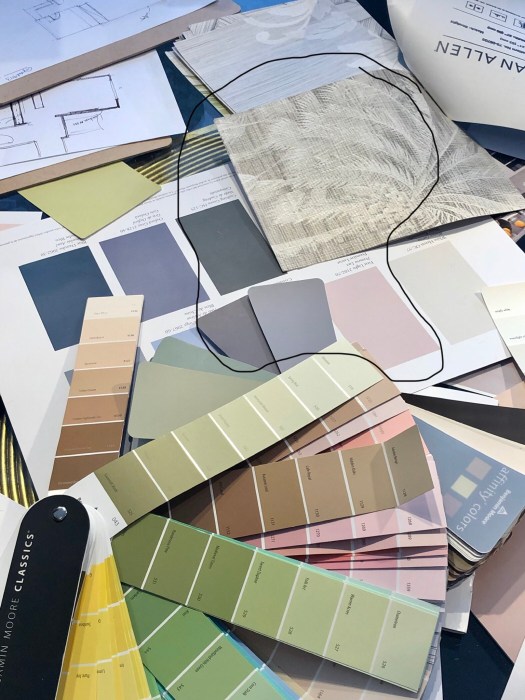
While communicating the suggested colour palette to your client, its good to show them the scale of each colour used: hide most of the colour card which will be used less behind the more common colour card for example. Most importantly though, make sure you take your clients to their threshold but definitely not over it!
Towards the end of the session, we all divided ourselves into groups and came up with our own colour palette centred around First Light – the colour of the year 2020:
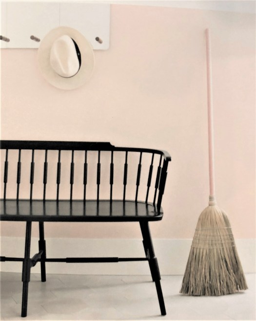
We came up with our own client brief and presented our colour palette respectively; our clients were a newly married couple living in a rented apartment. Our final proposal went with a light and airy living room and a dramatic open plan kitchen. First Light was used for two walls of the living room paired with a purple-y grey for the other two; a darker version of the latter being used for the kitchen cabinets – contrasting beautifully with first light as well as the white marble counter tops and floor. The purple-y grey was actually intended to be the transition colour. First Light then continued up to the bedroom and the corridor. The bedroom had a deep Olive green on three walls and a neutral patterned wallpaper (accent wall) against the headboard to break up the strong olive green and lighten up the room as well. Distressed/antiqued mirrors on cabinets coupled with one of the walls being completely windows served the very same purpose too – brightening up the overall palette and balancing out the deep dark olive green.
We all thoroughly enjoyed attending this workshop with Tony – a most gratifying experience satiating our design appetites for sure 🙂
