
The past few years saw many unsettled by global events – closing doors to retreat and regroup. However 2019 led to many of us opening our windows and letting the light in – experiencing a renewed sense of energy, optimism and purpose. Whereas many past trends (biophilic designs, fusion of minimalism and maximalism, sustainable design, the recycled/upcycled, technological and innovative breakthroughs) have most definitely further manifested themselves, 2020 seems to be most imminently marked by a vogue for versatility and optimism; whether it is in the context of multi-functional spaces, the storage decorative overlap, agender styling or lack of any seasonal borders, The recent Çolours of the Year unveiled by the industry maestros themselves testify to the same:
Recent years have seen the world of colours transition from bolder to much subtle neutral colours embodying the principle of versatility more and more.
After HeartWood and HoneySpice, Dulux has declared TranquilDawn as the colour of the year 2020:

Dulux has declared it the most versatile shade of green, reflecting upon the morning sky and able to introduce a ‘human touch’ to the surroundings. The versatility is further reflected in how it could be used for multi-functional spaces; for care or for play, to find meaning or for creativity , using the relevant colour palettes respectively.
For Trend Bible, the colour direction 2020 has evolved into six different shades embodying versatility, gender neutrality, optimism as well as lack of any seasonal borders – “…these six colours have been carefully selected to work in harmony with various coordinate colours, from neutral to bold across Spring Summer and Autumn Winter palettes. With an inclusive appeal in mind, both palettes embrace warm and cool nuances“. Amongst the suggested colours is the gender neutral ‘Dawn Pink’ – said to evolve into a unisex shade with a mauve tint – and of course the ‘Muted Clay’ manifesting the timeless spirit as well as adding the much needed warmth to the surroundings:
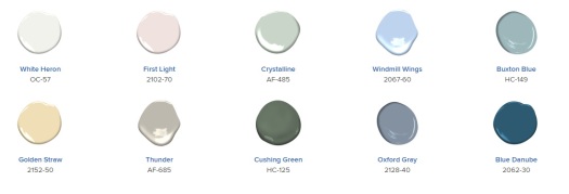
Benjamin Moore also announced its colour of the year for 2020 – ‘First Light’ – an upbeat and hopeful rosy pink; a fresh Palette emblematic of hope, potential, a revitalized spirit, and above all, agender styling as well as (once again!) lack of any seasonal borders and connotations– a befitting ‘backdrop for a bright new decade’.
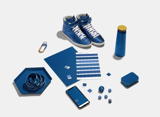
Lastly, Pantone’s hopeful ‘Classic Blue’ (Colour of the year 2020) further epitomizes gender-neutrality along with hope and optimism – a blue evocative of the vast and infinite evening sky – encouraging versatility in thinking, looking beyond the obvious. Despite standing apart from most of the subtle neutrals announced this year, classic blue does represent flexibility in all its glory – where this strong blue represents strength, authority and elegance, it also draws ones thoughts to reassurance, calm and confidence, increasing our perspective, opening up the communication flow; welcoming adaptability and versatility.

Lovely article 🙂 Check my post about Classic Blue to find out more about the colour, I’d love you to stop by! Keep up the good work and see you soon on the WP world
LikeLiked by 1 person
Thank you! Will definitely have a look👍
LikeLike